Visualizing geolocation data can be an excellent way to create fun visuals for talks and to make data checking easier. Below are several ways to display maps of geolocation data.
13.1 Loading in and checking data.
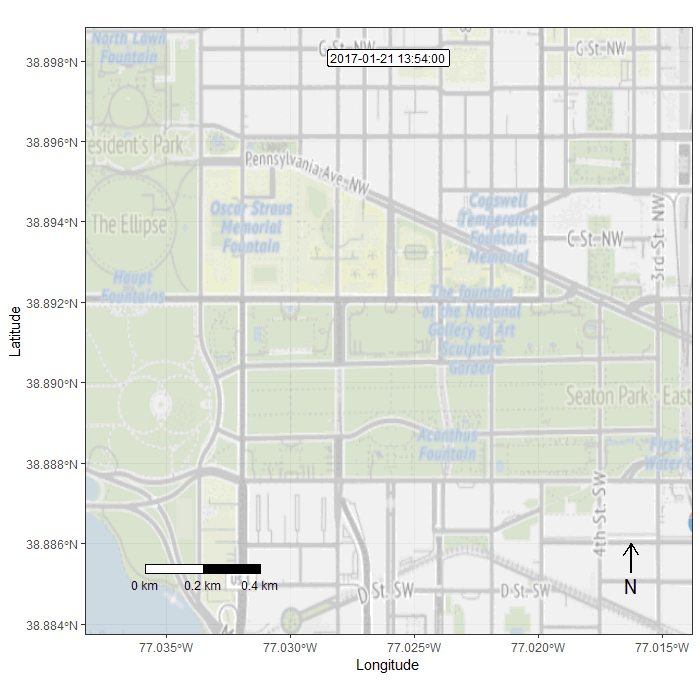
For these tutorials we will be using data from a single individual collected during the Women’s March on the Washington Mall using the Moves app. These data were pulled from a publicly available online tutorial.
Rows: 22
Columns: 7
$ date     <chr> "1/21/2017", "1/21/2017", "1/21/2017", "1/21/2017", "1/21/201…
$ name     <chr> "Place in Penn Quarter, Washington", "Place in Federal Triang…
$ start    <dttm> 2017-01-21 13:49:27, 2017-01-21 14:09:41, 2017-01-21 14:22:1…
$ end      <dttm> 2017-01-21 13:55:14, 2017-01-21 14:11:41, 2017-01-21 14:29:1…
$ duration <dbl> 347, 120, 421, 945, 747, 5114, 2459, 483, 1067, 699, 606, 103…
$ lat      <dbl> 38.89821, 38.89372, 38.89126, 38.88987, 38.89070, 38.88939, 3…
$ lon      <dbl> -77.02807, -77.02371, -77.01739, -77.01638, -77.01578, -77.01…
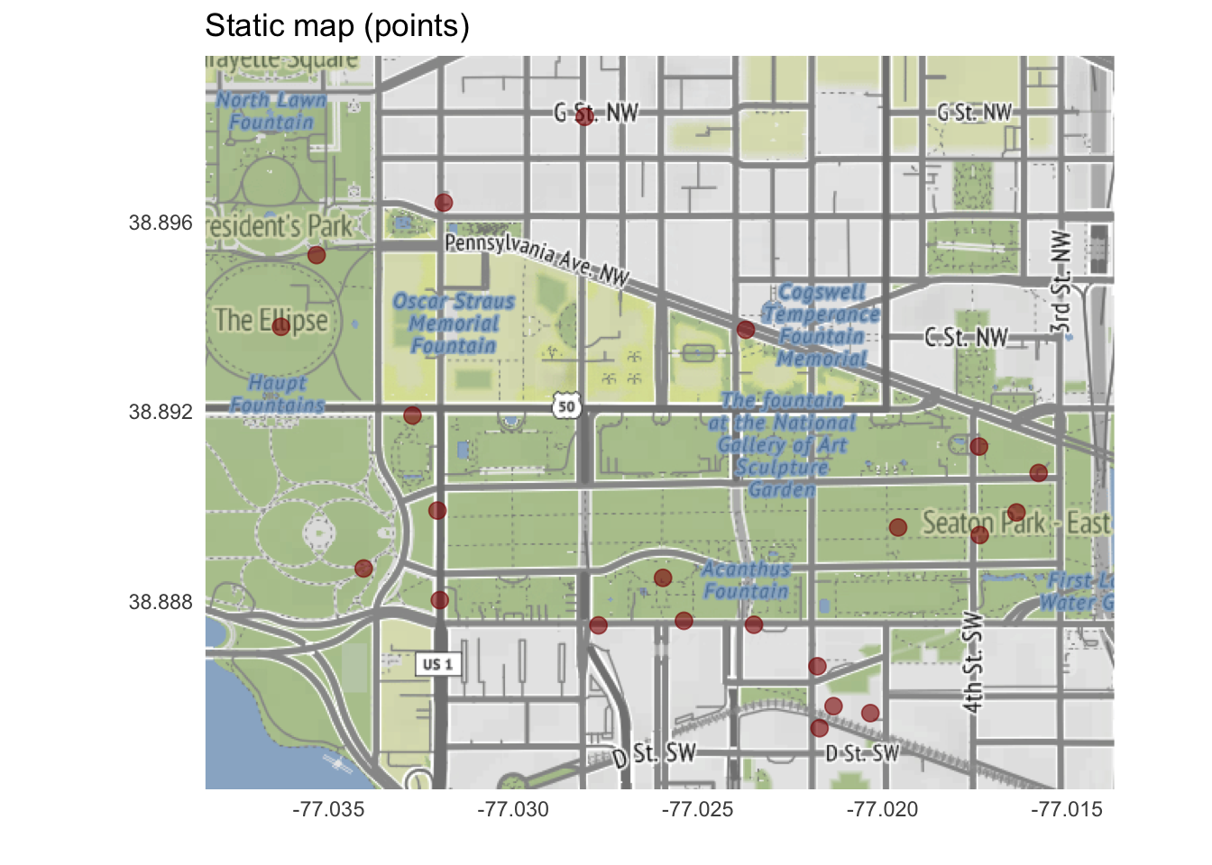
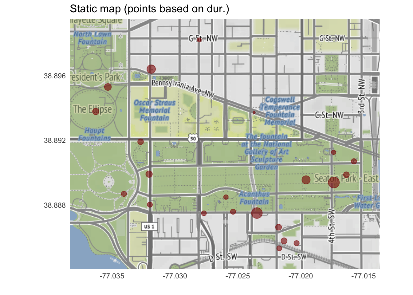
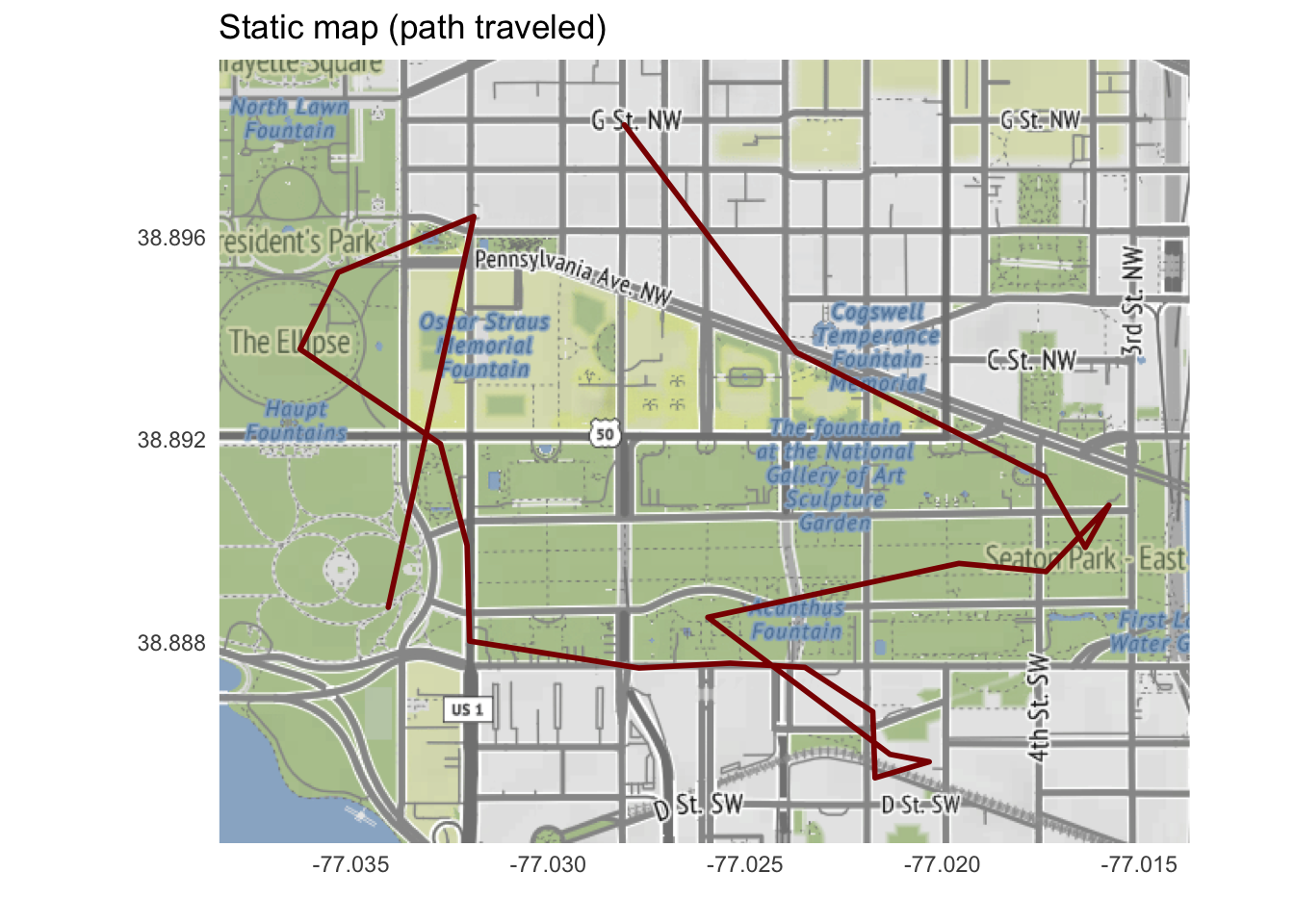
13.2 Creating static maps
Static maps can be created using the ggmap library. You will need to set an API key for Stadia Maps to access some of the available designs (specified using the maptype argument in get_map()).
You will need to first filter out any locations with less than 2 points (there is one such point in our location data). A later function will also be looking for an identification column, which will likely be present for any research participant data (but isn’t in these mock data, so we’ll add it in).
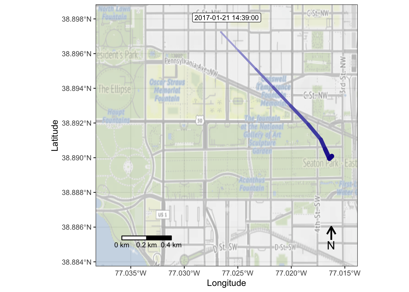
Next, we need to convert the GPS data into a move object.
gps_moves <-df2move(gps_filtered,proj ="EPSG:4326", # specifies the coordinate reference systemx ="lon", y ="lat",time ="start", # in other datasets, this might be dttm_obstrack_id ="subid") # your subject identifier goes here
Then, we take our move object and interpolate it to be at regular time intervals.
m <-align_move(gps_moves,res =5, unit ="mins") # data will be aligned to every 5 minutes
Temporal resolution of 5 [mins] is used to align trajectories.
Now we can overlay these movement patterns onto a map.
Checking temporal alignment...
Processing movement data...
Approximated animation duration: ≈ 4.68s at 25 fps for 117 frames
Retrieving and compositing basemap imagery...
Loading basemap 'terrain' from map service 'osm_stamen'...
Assigning raster maps to frames...
In general, it’s a good idea to look at some frames to make sure the map looks correct. You can index into your frames object using the following code.
frames[[10]]
Once you’ve checked a few frames and it looks like everything is rendering as it should, you can save out the animation as a gif.
Interactive maps using Leaflet provide an excellent way to explore GPS data with some new functionality.
library(leaflet)library(htmlwidgets)
13.3.2.1 Basic Interactive Leaflet Map
Here’s a basic interactive map with clickable points:
leaflet(gps) |>addTiles() |># adds the default openstreetmap tilesaddCircleMarkers(lng =~lon, # longitude column from datalat =~lat, # latitude column from dataradius =6, # size of circles in pixelscolor ="#000", # border colorfillColor ="#C5050C", # fill color (go badgers)fillOpacity =0.7, # transparency (0 = transparent, 1 = opaque)stroke =TRUE, # whether to draw borderweight =2, # border thicknesspopup =~paste0( # html popup when clicking points"<strong>", name, "</strong><br>","Date: ", date, "<br>","Start: ", format(as.POSIXct(start), "%H:%M"), "<br>","Duration: ", round(duration/60, 1), " minutes" ) ) |># center map on average coordinatessetView(lng =mean(gps$lon), lat =mean(gps$lat), zoom =13)
13.3.2.2 Map with Duration-based Sizing
We can also vary the point size based on duration to show how long the person spent at each location:
leaflet(gps) |>addTiles() |>addCircleMarkers(lng =~lon, lat =~lat,# scale radius by duration with minimum size of 3 pixelsradius =~pmax(3, duration/200), color ="#000", # black borderfillColor ="#C5050C", # red fill (go badgers)fillOpacity =0.6,stroke =TRUE,weight =1, # thinner border than previous examplepopup =~paste0("<strong>", name, "</strong><br>","Duration: ", round(duration/60, 1), " minutes<br>","Time: ", format(as.POSIXct(start), "%H:%M") ) ) |>setView(lng =mean(gps$lon), lat =mean(gps$lat), zoom =13)
13.3.2.3 Map with Movement Path
For showing movement patterns, we can add lines connecting the locations in chronological order:
# first sort data by time to ensure correct path ordergps_ordered <- gps |>arrange(as.POSIXct(start))leaflet(gps_ordered) |>addTiles() |># add polylines !first! so they appear under the pointsaddPolylines(lng =~lon,lat =~lat,color ="#C5050C", # go badgersweight =3, # line thicknessopacity =0.7# line transparency ) |># add circle markers on top of the linesaddCircleMarkers(lng =~lon, lat =~lat,radius =5,color ="#000", # black borderfillColor ="#FFF", # white fill (go badgers)fillOpacity =0.8,weight =2,popup =~paste0("<strong>", name, "</strong><br>","Time: ", format(as.POSIXct(start), "%H:%M"), "<br>","Duration: ", round(duration/60, 1), " minutes" ) ) |>setView(lng =mean(gps$lon), lat =mean(gps$lat), zoom =13)
13.3.2.4 Map with Color-coding
We can also add color-coding to better visualize patterns in the data:
# example with color-coded duration using viridis palettegps_chron <- gps |>mutate(start_time =as.POSIXct(start),duration_min =round(duration /60, 1) ) |>arrange(start_time)# create color palette for durationpal <-colorNumeric("viridis", domain = gps_chron$duration)leaflet(gps_chron) |>addTiles() |>addCircleMarkers(lng =~lon, lat =~lat,radius =6,color ="#000",fillColor =~pal(duration), # color by durationfillOpacity =0.7,weight =1,popup =~paste0("<strong>", name, "</strong><br>","Duration: ", duration_min, " minutes<br>","Time: ", format(start_time, "%H:%M") ) ) |>addLegend(pal = pal, values =~duration,title ="Duration (sec)",position ="bottomright" ) |>setView(lng =mean(gps_chron$lon), lat =mean(gps_chron$lat), zoom =13)
13.3.2.5 Map with Layer Controls
For datasets with multiple participants or groups, we can use layer controls to toggle different groups on and off:
# artificially split data into two "participants" to demonstrate layer controlsgps_participants <- gps |>mutate(start_time =as.POSIXct(start),# split by time - early vs late attendeesparticipant =ifelse(start_time <median(start_time), "Early Attendee", "Late Attendee") ) |>arrange(start_time)# create base mapmap <-leaflet() |>addTiles() |>setView(lng =mean(gps_participants$lon), lat =mean(gps_participants$lat), zoom =13)# define a functionadd_participant_markers <-function(participant_name, map_obj, data, colors) { participant_data <- data |>filter(participant == participant_name) color_index <-which(unique(data$participant) == participant_name) map_obj |>addCircleMarkers(data = participant_data,lng =~lon, lat =~lat,radius =6,color ="#000",fillColor = colors[color_index],fillOpacity =0.7,weight =1,popup =~paste0("<strong>", name, "</strong><br>","Group: ", participant, "<br>","Time: ", format(start_time, "%H:%M"), "<br>","Duration: ", round(duration/60, 1), " minutes" ),group = participant_name )}# get all participants in a listparticipants <-unique(gps_participants$participant)colors <-c("#C5050C", "#2E86AB") # red, blue# use reduce() to apply the function to each participantmap <- participants |>reduce(\(map_obj, participant) add_participant_markers(participant, map_obj, gps_participants, colors),.init = map)# add layer controls to toggle groupsmap |>addLayersControl(overlayGroups =unique(gps_participants$participant),options =layersControlOptions(collapsed =FALSE) )